Redesigning the Airtel Thanks app

Why Airtel Thanks App?
I received a message…

Wait, I use that app 2–3 times every month and how did I not notice they have a “call logs” feature? Let's try to find it…


Upon scrolling further down for around 50–60 kilometers, I found the “call logs” along with coupons and a refer-to-earn scheme. Why?
(also, I don't think anyone has ever called it “call manager”)

This whole situation made me realize about this app’s questionable interface.
Analysis
let's analyze their existing app and find out how we can make it better


lastly, a whole mix of tools, services, ads, and schemes makes it really difficult for a user to differentiate between these elements
Redesign
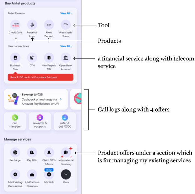
Before we start, here are some things I noticed while going through their app
- Airtel Finance- Airtel has recently been emphasizing on their finance-related products such as credit cards, loans, etc. This is something I will have to keep in mind while redesigning.
- Online Payment- Airtel wants its users to use their app for more finance-related use. They have also added online payment as a tool in their app. (I will be making the bottom app bar such that it gets easier for people to use it as an online payment app)
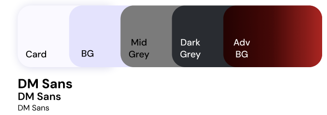
Design Palette
Components
Now, to redesign I had to put down all the elements from the home page
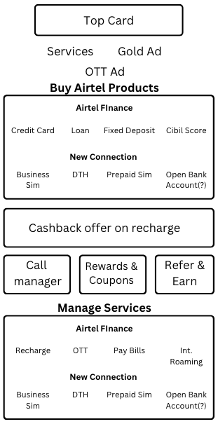
Since all the elements are in a mixed format (based on their nature) I put them down in a list and labeled them accordingly.
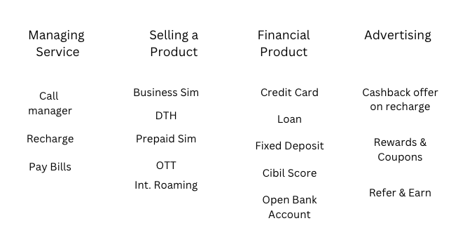
This is the format I will be using while making the app prototype
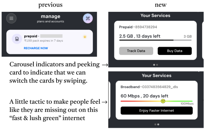
Top Card
This card on top of the app is well-designed. It shows me my primary connection, only the essential information, and a clear CTA button. The only problems I could find here are
- I use 3 of their services. Why am I only shown one?
- What does this red dot denote?

Cards and Iconography
Here are some of the major problems I noticed in the cards and icons

And here is what I made out of it
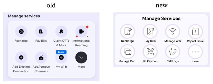
Bottom Menu Bar
Why did they add separate Shop, Pay, and Help icons in the bottom app bar when we can do all those from the Home Page? That is something we will venture into some other day. For now, this is how I redesigned it

- A darker color to make it much more noticeable
- Higher contrast for the icons and text. The previous text did not pass the 1:3 color ratio test.
I added an online payment button at the center rather than the top corner and made it bigger to make it more noticeable for the users. This would encourage them to use this app for online payments
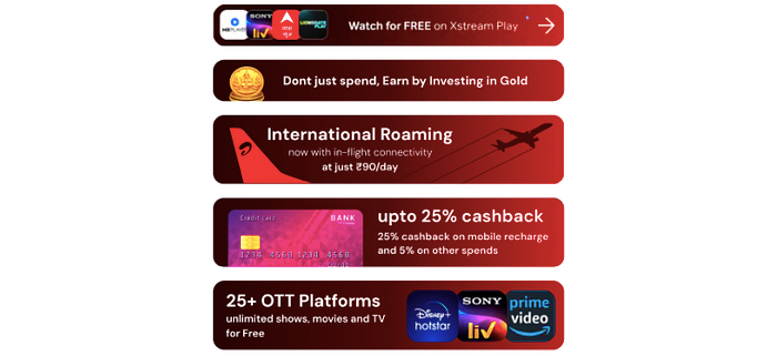
Advertisements

To solve this, I made all the ads in a similar presentation with a bright theme color, making the advertisement stand out from the rest of the elements.
Final Results
And with some final touches like a
- Search Option- for when you are trying to find something specific
- Menu Sidebar- for things that you don't often use like adding/removing a connection, account settings, etc
here is the final prototype